|
section
one
chapter
one
planning a page of
The Spirit: The New Adventures 7
breaking
down the pages
My
longtime collaborator Dennis P. Eichhorn and I did a Spirit story
for Kitchen Sink. Denny worked up a synopsis after quickly reading
several issues of Will Eisner's Spirit reprints. This was
his first encounter with the Spirit, so it's a testament to his
writing skills that Denny captured the subtle aspects of Eisner's
story style, humor, and characterizations.
|

|
fig
1
I
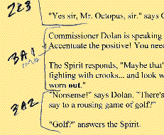
start by breaking Eichhorn's script into panel sections
to time the story, decide on optimal page breaks, and
figure out the final page count.
"3A1" refers to page 3, tier A, panel 1. Page 3 is
used in the example Figures 4-8 below.
|
|
I
set out breaking
the story down my usual way. Eichhorn provided a full script with
a panel by panel description. I usually change this breakdown so each
character depicted in a panel speaks only once. Unless it's unavoidable,
I don't like for the character on the left to speak first, then to
speak again after the character to the right answers. If they each
speak only once per panel, the reader's eye doesn't have to travel
backward to the first character, which stagnates the story. As a result,
my breakdown usually generates more panels than Denny plans for. I
also throw in silent panels to establish "beats" in the story pace,
plus I like to plan for a splash page.
Eichhorn planned for a story seven or eight pages long. After going
through the text (fig 1), I came up with 11 pages of what was
to be densely framed art.
|
fig
2
My
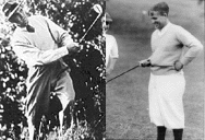
Spirit is loosely based on golfer Sam Snead (left) and
my Dolan is loosely based on golfer Bobby Jones (right).
|

|
|
Next
I gather references.
For this page I needed costume designs for the Spirit and Dolan (fig
2), circa-1950 golf clubs, Wildwood Cemetery, and the Spirit's
home there. For the rest of the story I needed an air gun, an old
American windmill, golf course landscapes, a hot air balloon on
and on.
My friends on the Kirby and Eisner mailing lists (don't laugh)
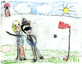
helped me with Spirit minutiae. My daughter Lucie (six years) designed
Ellen Dolan's outfit (fig 3).
Next
comes the
business of designing pages.
|
|
Fig
3
My
daughter Lucie (six yrs) often draws at my side. Here
she shows Ellen Dolan and the Spirit playing golf.
Notice the Octopus' balloon hovering ominously in
the upper left!
Lucie designed Ellen Dolan's wardrobe for my story.
|
|
|
|
Fig
4
Page
3 of the Spirit story is roughed out with markers to
indicate everything from panel breakdown to black spotting.
Full text balloons are included to make sure that they
fit and that it "reads" properly.
The basic layout made it to the final art intact, except
for the lower left panel, which was changed to show
the Spirit climbing out of the ground in his cemetery
home, instead of walking through a door.
|
|
Using markers on
typing bond I hack out rough layouts complete with balloons (fig
4). After laying out the entire page with a fine-point Sharpie,
I slash in the black spotting with a fatter marker.
For this project, I stuck closely to these guides. As bad as they
look, it's hard to underestimate the importance of even the crudest
"roughs." If you try to approach the pages without them you're setting
yourself up for too many arduous decisions that complicate the technical
challenge of drawing. Guys like Steve Rude or Mark Badger actually
project their roughs up to final art size and re-pencil them, while
I just use them to gauge where I'm headed with a page design. The
true use of thumbnails is that you draw them at the closest possible
speed to the speed at which the comic will be read by your audience.
They are your best shot at drawing something almost "as you read it"
so they are the spontaneous
spine of your storytelling.
|
|
Eichhorn,
Dennis P.
Golf
Eyeball Figurine
2.25",
1998
Whenever
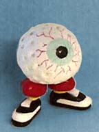
I work on a story with Denny he sends keepsake gifts
that tie into our story's subject or locale. Sometimes
he makes them himself, like this transformed golf
ball rattle, in honor of The Spirit.
I have a shelf in my studio full of
Denny´s souvenirs.
|
|
next
page: doing the final art
|
